
Why Design Fundamentals Matter
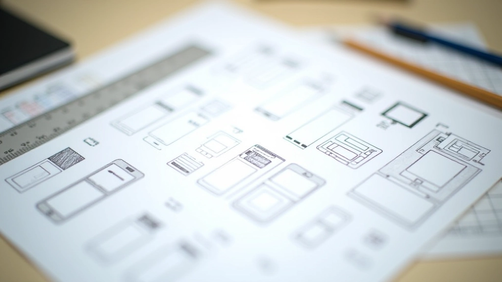
Good UI design isn’t magic. It’s the result of understanding a few core principles and applying them consistently. Whether you’re designing a mobile app, a website, or any digital product, these fundamentals are your foundation.
Think about the apps you use every day. The ones that feel natural to use? They’re built on solid design principles. The ones that frustrate you? They usually ignore them. The difference isn’t complexity — it’s intention.
You don’t need years of experience to understand these principles. You need to know what to look for and how to apply it. That’s what we’re covering here.

Educational Resource
This guide is an educational resource designed to help you understand design principles. Every project, audience, and context is different. Apply these principles thoughtfully to your specific situation, and test your designs with real users to see what works best for them.
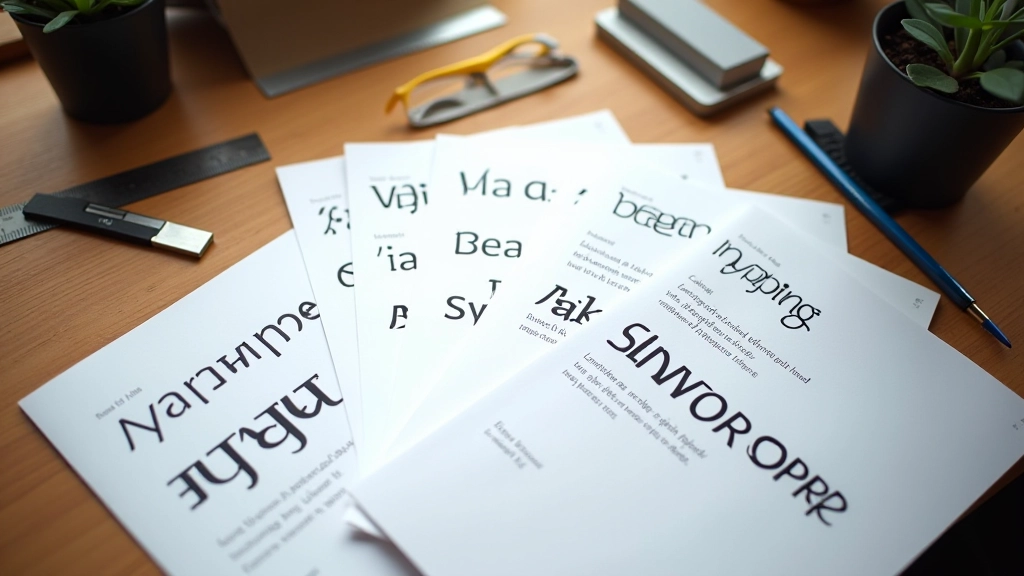
Typography: Making Text Work
Typography is how your content gets read. Bad typography means people struggle to understand your message. Good typography? They don’t even notice it — they just read naturally.
Start with these three things: pick a readable font (stick with system fonts or proven web fonts), set a clear size hierarchy (don’t make every text size different), and give text room to breathe with proper line spacing.
Line height matters more than most people think. At 1.4 to 1.6 times your font size, text becomes noticeably more readable. On screens, we often go even wider — 1.6 to 1.8 — because pixels are different from printed paper.
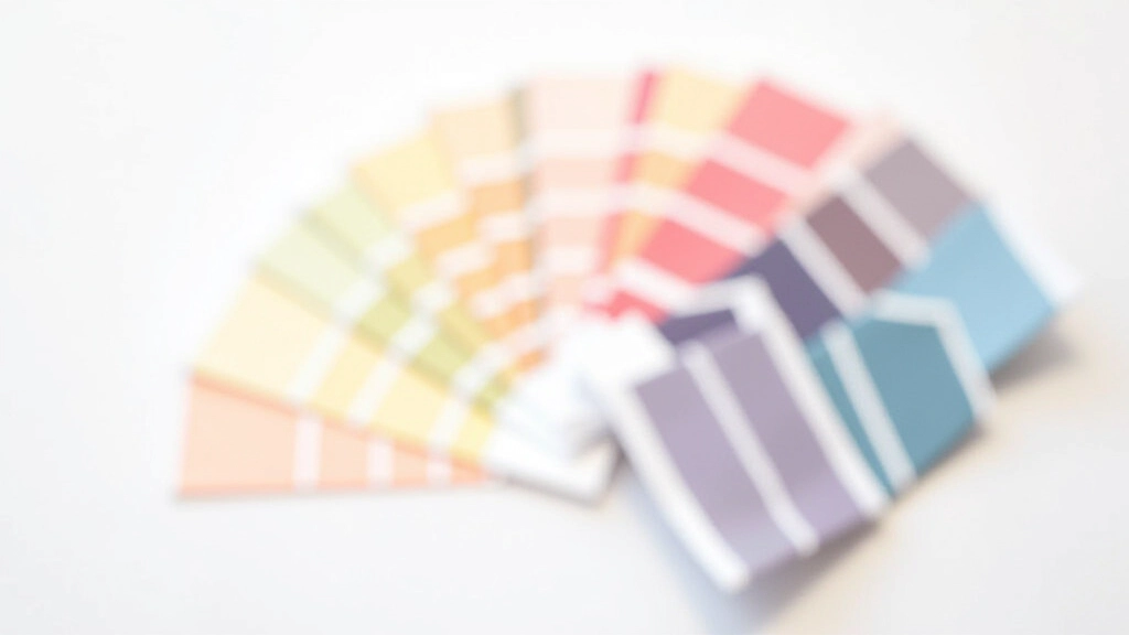
Color: Beyond Looking Nice
Color does two things in interface design: it makes things look good, and it communicates meaning. A red button says “warning” or “important.” A green button says “go” or “confirm.” This isn’t random — it’s learned behavior across the web.
But color has limits. Not everyone sees color the same way. About 8% of men have some form of color blindness. So don’t rely on color alone to communicate. Use color plus shape, text labels, or position.
Contrast is non-negotiable. Text needs to stand out from its background. The Web Content Accessibility Guidelines recommend a contrast ratio of at least 4.5:1 for normal text. That’s not optional — it’s accessibility.
Spacing: The Invisible Architecture
Spacing is the most underrated fundamental. It’s what separates a cluttered interface from one that feels calm and organized. The space between elements is just as important as the elements themselves.
Use a consistent spacing scale. If you use 8px as your base unit, build everything from multiples of that: 8px, 16px, 24px, 32px, 48px. This creates visual harmony even if you’re not thinking about it consciously.
Padding (space inside a button or card) and margin (space outside) do different jobs. Padding makes things easier to tap and read. Margin creates relationships between elements. A good rule: use padding to make elements breathe, margin to group related things together.
Visual Hierarchy: Guiding the Eye
Visual hierarchy tells users what matters. It’s the difference between “look at everything equally” and “start here, then go there, then read this.” Strong hierarchy guides users through your interface without them thinking about it.
Create hierarchy through size, weight, color, and position. The most important element should be larger, bolder, and more prominent. Secondary elements step back. Tertiary information becomes subtle. This isn’t subjective — it’s about guiding attention.
On a mobile screen with limited space, hierarchy becomes even more critical. You can’t fit everything. You have to choose what matters most. That forced choice actually makes better design. It forces clarity.
Put It Together
These five fundamentals — typography, color, spacing, visual hierarchy, and consistency — aren’t rules you follow blindly. They’re tools you use intentionally. Once you understand them, you’ll start seeing them everywhere. You’ll notice when an interface feels wrong (usually because it’s violating these principles). You’ll understand why good design feels effortless.
The best part? You don’t need fancy tools or years of experience to apply them. Start with what you’re working on today. Pick one principle. Apply it deliberately. Notice the difference. That’s how design mastery actually happens — one conscious choice at a time.
Ready to go deeper?
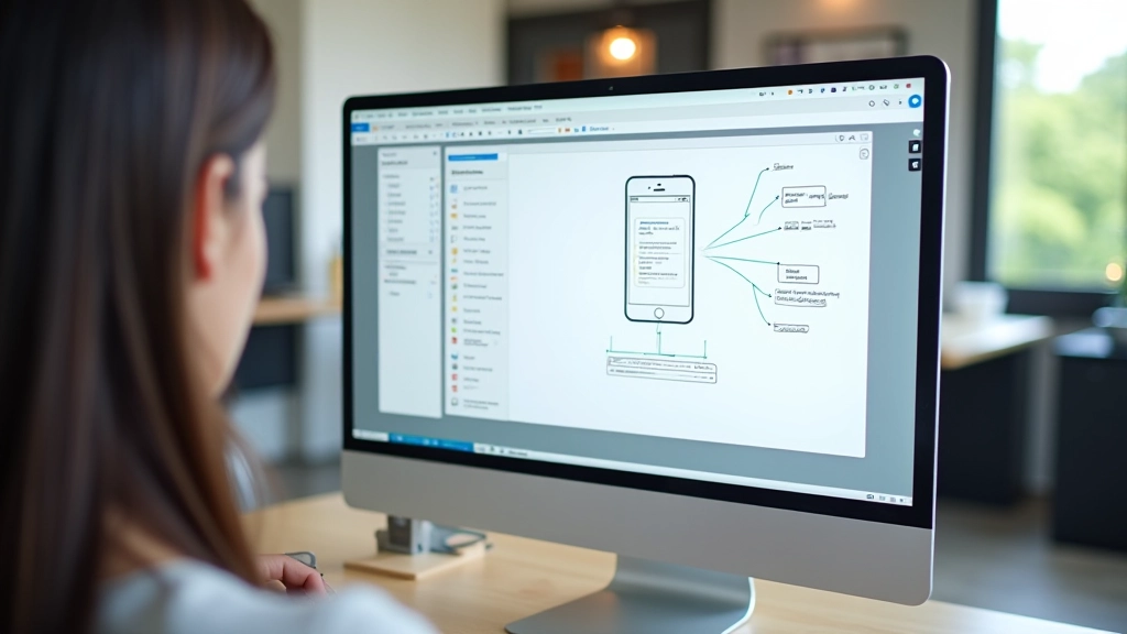
Explore how these fundamentals apply to real projects. Learn about user flows, prototyping, and design trends shaping Southeast Asia.
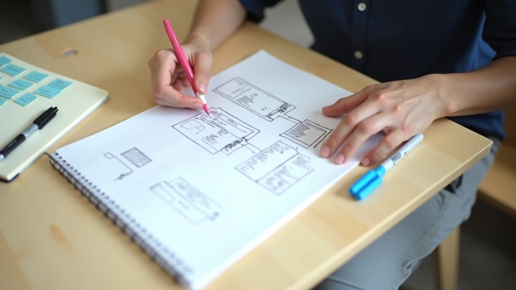
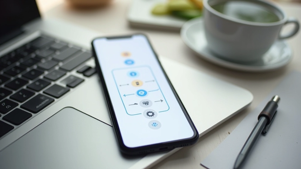
Explore User Flow Mapping